
VENDOR PORTAL
A portal design ensuring seamless experience for suppliers and buyers.
Project Overview
The Vendor Portal serves as a pivotal link between purchasers and buyers, facilitating seamless transactions and streamlined operations. It ensures a smooth journey from initial registration to comprehensive data monitoring and analysis. Integrated with Business Central, a robust Software as a Service platform, it offers efficient data management capabilities.
Project Goal
The primary goal of this project is to create a vendor portal that simplifies and streamlines the entire process from Request for Quotation (RFQ) to procurement.
Responsibilities:
UI/UX Design, User Research, Digital Wireframing and Mockup
Tool:
Figma
Design Process
My task was to design an end-to-end experience for the procurement process in a vendor portal. I started with the assumption that navigating and handling the procurement process manually was difficult. Following the design thinking methodology, I validated this assumption through user research. I then shaped the solution by defining key user interactions and continuously tested and iterated on the designs to ensure an intuitive and efficient user experience.

Empathize

Define

Ideate

Prototype

Test
Understanding the Users
User Research: Summary
Phase 1: Defining Target Users
To identify the target users, I began by interviewing stakeholders to understand the different types of users interacting with the vendor portal. These interviews helped clarify the specific user groups I needed to focus on.
Phase 2: Understanding User Interaction
After defining the target users, the next step was to explore how these users interact with the vendor portal. I created personas and user journey maps to gain deeper insights into their behaviors and experiences. This process revealed potential problems and pain points users faced while navigating the portal, guiding the design process towards effective solutions.
User Research: Pain Points
1
Human Error
The procurement process often encounters hurdles due to human error and manual inaccuracies, resulting in a lack of transparency and efficiency. Human errors, such as data entry mistakes or miscommunication, can lead to misunderstandings and delays in the procurement workflow.
2
Lack of Real-Time Updates:
Without real-time order tracking, users may be left in the dark about the status of their orders.
User Personas
Purchasing Manager - Anahita Sharma

Age - 40
Education - Post Graduation
Hometown - Delhi
Family - Parents, younger brother
Occupation - Project Manager
Background:
Anahita is a purchasing manager with over a decade of experience in procurement. She oversees the procurement process for her company, including sourcing suppliers, negotiating contracts, and managing budgets.
Goals and Needs:
-
Streamline procurement processes to save time and reduce manual errors.
-
Access real-time data and analytics to make informed purchasing decisions.
-
Collaborate effectively with suppliers and internal stakeholders.
Pain Points:
-
Manual data entry leads to errors and delays.
-
Lack of visibility into supplier performance and order status.
-
Difficulty in managing a large volume of purchase orders and invoices.
Supplier Coordinator - Ashwin Singh

Age - 38
Education - Graduation
Hometown - Delhi
Family - Parents
Occupation - Supplier Coordinator
Goals and Needs:
-
Receive clear and timely purchase orders from buyers.
-
Easily communicate with purchasers regarding order status and delivery schedules.
-
Submit invoices and track payments efficiently.
Background:
Ashwin works as a supplier coordinator for a manufacturing company. His responsibilities include managing relationships with vendors, processing orders, and resolving any issues that arise during the procurement process.
Pain Points:
-
Manual data entry leads to errors and delays.
-
Manual invoicing processes leading to delays in payment.
-
Difficulty in managing multiple orders from different buyers.
User Journey Map
I created user journey map of Ashwin Singh for procurement process from suppliers' side to identify more insights and improvement opportunity.
Stage 1: Order Processing
Ashwin receives purchase orders from buyers through the Vendor Portal. He confirms receipt of the orders and provides estimated delivery dates to purchasers.
Stage 2: Fulfillment
Ashwin prepares and dispatches the ordered goods as per the agreed-upon schedule. He updates the order status and provides shipment tracking information to purchasers through the Vendor Portal.
Stage 3: Invoicing
After delivery, Ashwin generates invoices and submits them through the Vendor Portal. He monitors invoice statuses and follows up on any outstanding payments with purchasers.
Stage 4: Feedback
Ashwin collects feedback from purchasers on the quality of goods and services provided. He addresses any issues or concerns raised by purchasers to maintain a positive vendor-buyer relationship.
Site Map
To better understand the navigation flow, I created a site map. This tool provided deeper insights into the portal’s structure and helped identify areas for improvement.
.jpg)
Design and Test
Design Ideation
Based on the key features identified during the user research process, I began constructing the user experience flow using sketches and wireframes. During the design phase, I focused on the following:
-
Visual Consistency: Ensuring that elements are easy to understand and interact with.
-
Intuitive Navigation: Providing users with the ability to easily return to their starting point.
-
Error Prevention: Designing the interface to minimize the chances of user errors by providing clear instructions and validations.


Mid-fi wireframe for SINGLE PURCHASE ORDER , showing the complete deliveries on the PO.
Mid-fi wireframe for dashboard, introducing overall analytics of the portal
Usability Testing
Usability Testing for procurement process
A prototype was tested to uncover critical issues in the design. The main goals of the usability testing were to evaluate ease of navigation, identify bottlenecks, and observe the paths users took to complete each flow. The test included participants with varying levels of experience to ensure that the vendor portal would be easily understood by all users.
Results from the test revealed following insights:
-
Users struggled to locate delivery information for specific purchase orders (POs).
-
Users were confused about the context of the call-to-action (CTA) button in the purchase order interface.
Refining the Design
Based on feedback collected from usability testing, the following priority revisions were made:
-
Provided clear context for the call-to-action (CTA) button to reduce user confusion.
-
Instead of requiring multiple clicks to check "posted deliveries," I included the "posted deliveries" section on the same PO page.
Before Usability study
After Usability study
clear context of CTA


includes "Posted Deliveries on the same page of PO
High- Fidelity Prototype
Using wireframes and conducting usability testing, I was able to create a clean and intuitive user flow for the procurement process. This approach ensured that the design was both user-friendly and effective in meeting user needs.
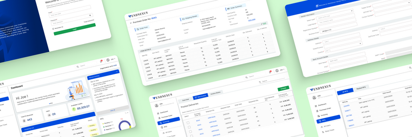
View - High Fidelity Mockup

Mockups
_edited_edited.jpg)
_edited.jpg)

Takeaways
-
Exploring multiple solutions enabled me to consider different concepts and determine which approaches best align with user-centric design principles.
-
Collaborating with developers provided valuable insights into how the design can be implemented in real-world scenarios and how it can integrate with SaaS products.
-
This collaborative and exploratory process ensured that the final design was both practical and effective in meeting user needs.
Next Steps
-
At this stage, the project remains in a flexible phase, continuously evolving based on feedback from users and stakeholders.
-
My next step is to continue iterating and testing the design in response to potential business changes.
-
Additionally, I will seek further insights to enhance usability, ensuring the design remains user-centric and aligned with business goals.